How to not be deceived by happy users?
About:
BlissU is India’s first platform connecting mental wellness experts with seekers through a live, interactive community for real-time engagement and support.
Challenge:
To scale the app beyond MVP to meet user demands and boost engagement
Impact:
Helped people build a digital support network during Covid-19 lockdown
Client:
BlissU Wellness, India
My role:
User Research UI Design Figma Prototyping Usability Testing
Timeline:
April 2021 - July 2021
Reduced time spent on choosing a live session
4x
Boosted weekly in app user engagement
300%
System Usability Scale score from 47.5 (F) to
82(B)
Research Question:
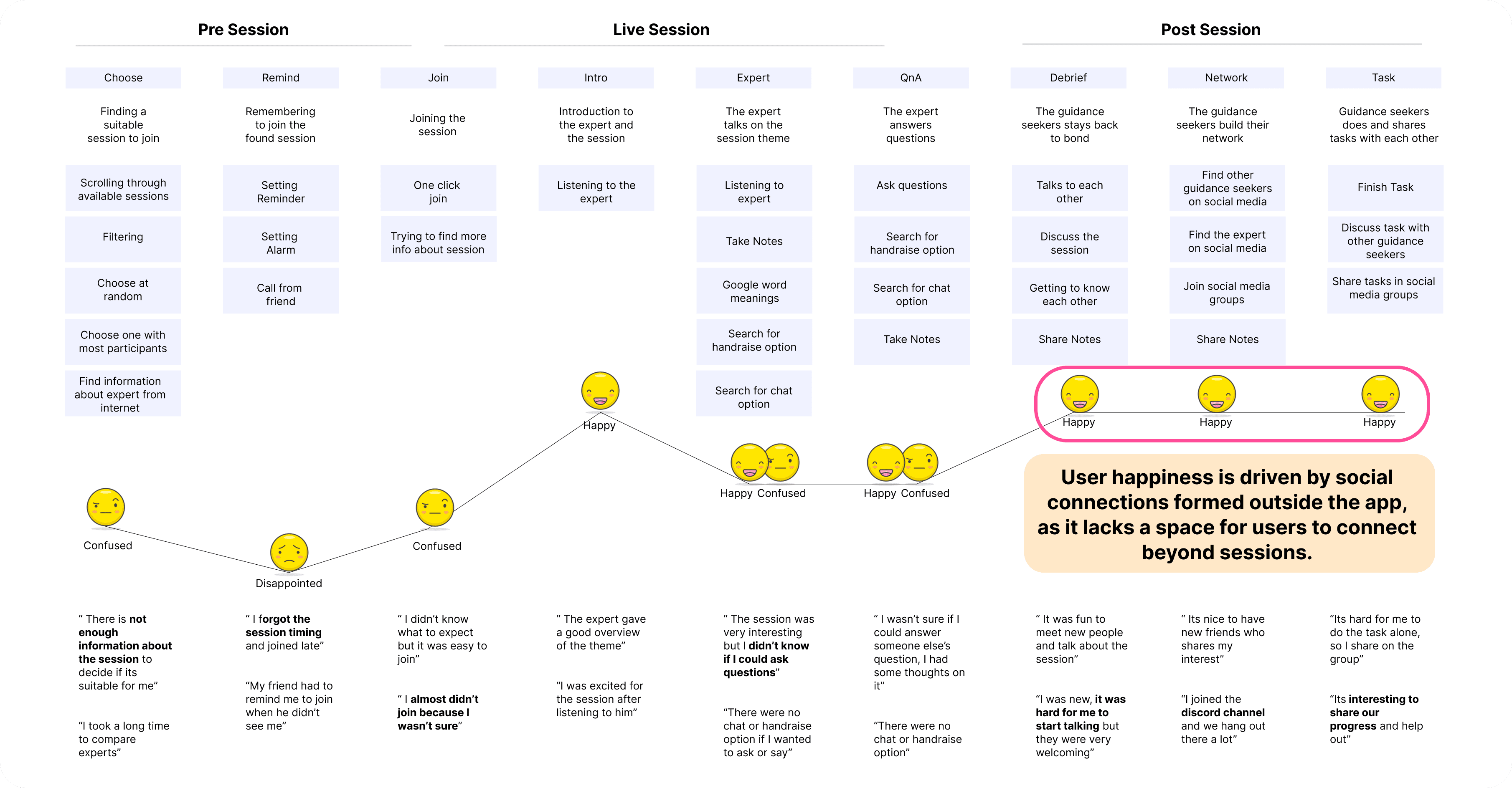
What are the key touchpoints in the app that can be improved to better support users as they discover, join, and engage in live sessions?
Assessing the UX
Interviews
Heuristic Analysis
Interviews with 6 loyal customers to understand their experience in the live sessions and their needs
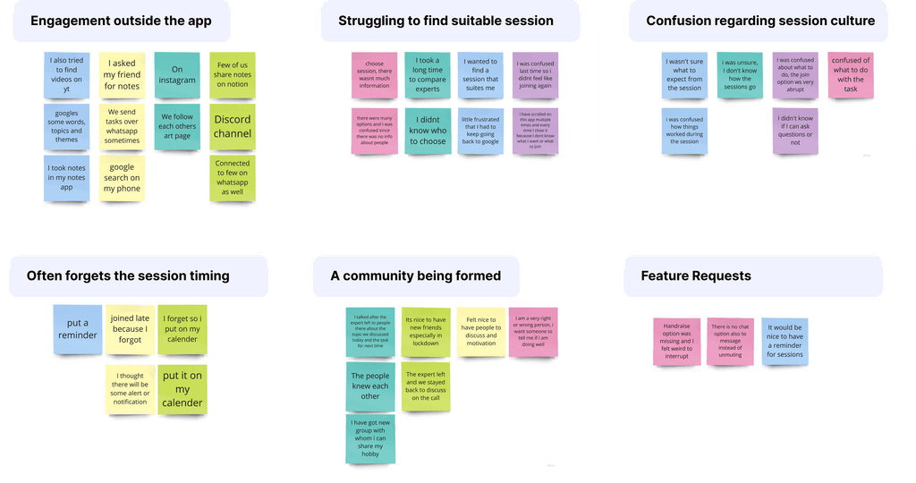
6 areas of improvement
1.
Improve visual cohesion
2.
Ease of choosing session
3.
Add session reminders
4.
Reduce confusion about sessions
5.
Improve in-app engagement
6.
Add in-app community features
Ideation and Design
Challenge 1
Enhance the onboarding flow by including a step that asks users about their goals
Concept 1
Concept 2
Concept 3
Logic:
Users choose what they want to improve in life and the app uses it to recommend sessions later
Limitation:
Lack of self awareness might be a barrier to choosing the suitable options
Concept decision
Concept 1 was finalised since allows people to start with an improvement mindset and utilise recmmendations to delve deeper
Challenge 2
Give relevant recommendation to the user to ease the process of choosing suitable session
Concept 1
Concept 2
Logic:
The app recommends sessions/experts based on user’s previous activity
Limitation:
Isolation from other forms of wellness resulting from algorithm feeding to personalised interest
Concept decision
Concept 1 was finalised since it allows people to explore relevant sessions and experts who specialise in their interested topic
Challenge 3
Provide more information to the user to ease their anxiety around choosing and joining sessions
Concept 1
Concept 2
Concept 3
Concept 4
Logic:
The live session cards contain more information about the session and expert including their other work
Limitation:
This offers enough info to decide, though user preference to form of wellness require attending the session
Concept decision
Concepts 1 and 3 were finalized to provide users with more information about the session's topic and format, reducing confusion
Prototype
Challenge 4
Design interventions to boost user’s in-app engagement
Community
Notes
Reminder
Logic:
Users spend time on social apps to connect, form groups, chat and follow with each other. Having in app social space will improve the engagement.
Limitation:
However the user’s community profile related features require much deeper and focused user research to understand the social behavior of users on the app. This should be the next step.
Testing
Usability Testing
28 participants
You want to manage your anxiety using the app. Choose a session that suits your needs. Read the guidelines for the session. Find and explore the note-taking feature.
Data
Iteration
Heat map:
Low rate of users clicked the Hamburger menu within first 3 clicks, while there more clicks on chat option that might resemble notes
Dwell time:
An average of 16 sec dwell time on this screen
Task success:
40% participants failed to find notes and guidelines
Beta Testing
22 participants
The Weekly Plan recommendation (concept 2 from recommendations) was tested
Interview data:
86% preferred a weekly wellness plan, finding it easier than selecting their own sessions
Recommendation
Include daily plans from mental health experts to their community as part of the pricing.
Impact
SUS Score before
SUS Score after
Reflection
Deep Listening
Being critical and really listening to users revealed that genuine happiness stemmed from their external social engagements—a nuance I might have missed without a deeper dive.
Impact Visualization
I recognized the need for clear visual metrics to capture engagement boosts, which would better communicate the impact of our design decisions.
Accessibility Insight
In 2021, my awareness of accessibility was limited; this project underscored its importance and pushed me to prioritize inclusive design moving forward.
Explore other projects
The UX of VR Body Mapping
Developed a self reflection tool for people involved social justice work utilising VR body mapping as a tool to express emotional labour.

How to UX if you can't talk to users?
Redesigned multistep onboarding for finance app to reduce the task drop off rate by 40%